

Process: A Wordless Love Letter

After several years of being apart, my husband and I finally moved in together in our very first apartment yet.
We wanted to create a space that we can call "home" without boxing ourselves in trends that would limit our designing freedom. Since my husband is most elusive to the camera (I know, right?) and have always been an advocate against selfies and photographs randomly posted around the house, I took the road less taken by painting a huge portrait that screams, "Make no mistake, it's us!"
I constantly try to stay as close to reality as possible as far as narrative is concerned. However, for the sake of stimulating my imagination, I injected twisted versions of familiar yet fascinating elements found around our neighborhood that best represents our humble life. This is how I was able to freely express with love and pleasure.
The whole process is also documented in my Youtube channel. You can watch it here.

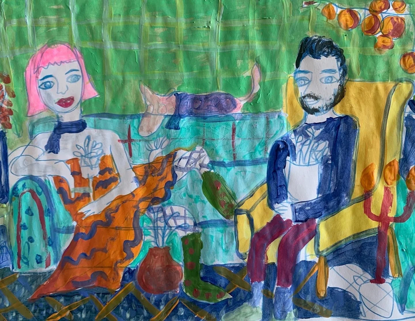

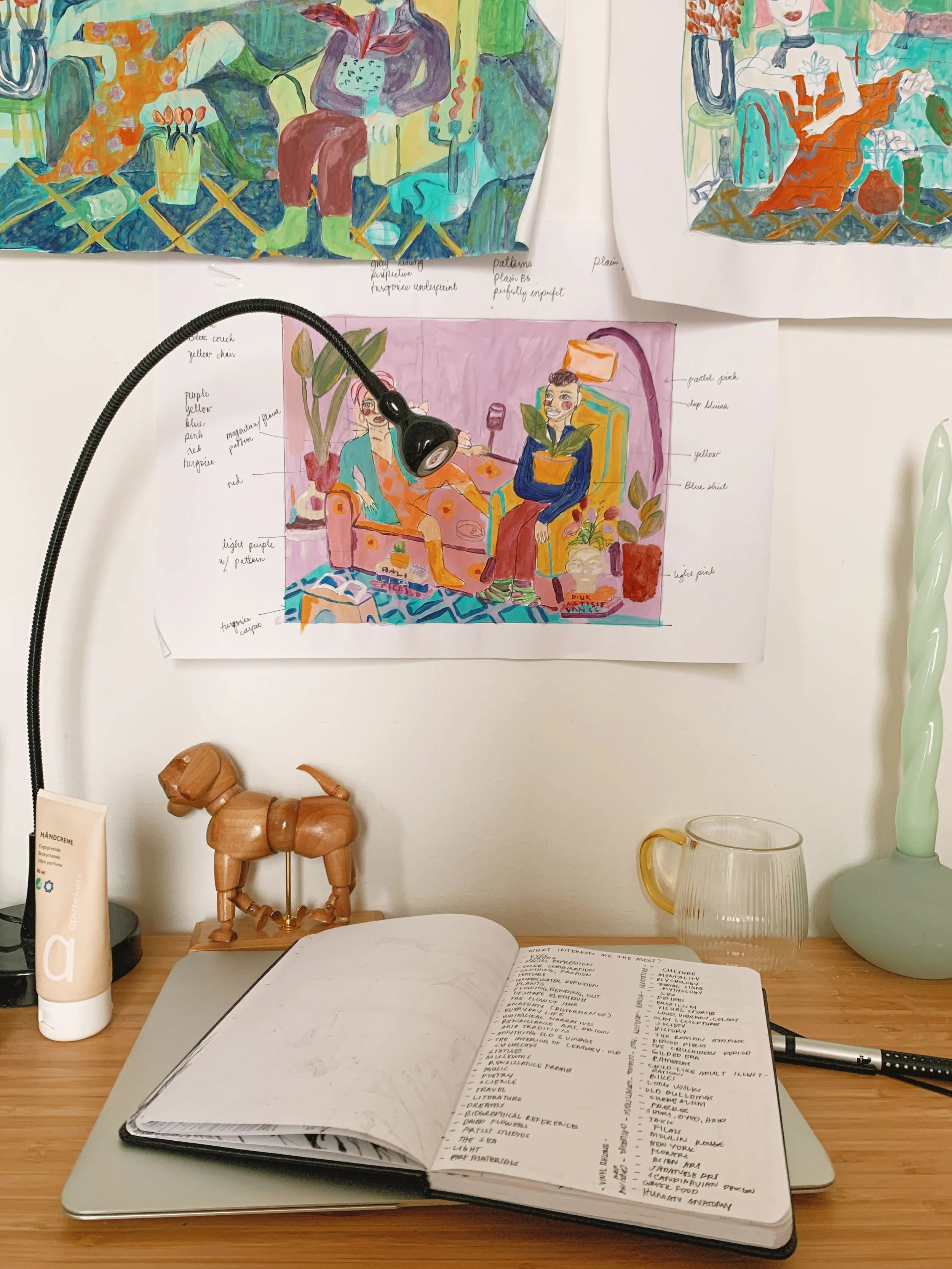
COLOR STUDY: Acrylic, colored pencil and ink on paper.
I made three different types of color studies to achieve the best possible representation of the current hygge living in our household. Since this project began at the early part of summer this year, I concluded with brighter colors.
INSPIRATION: Hope Gangloff
To be honest, I've had enough of the world telling me to take it easy on colors. I'm a rebel and I've had my own series of internal conflicts on color combination but it's essential for me to introduce pops of colors in a rather monotonous home without compromising visual relaxation. The TV was made colored for a reason, don't you think?
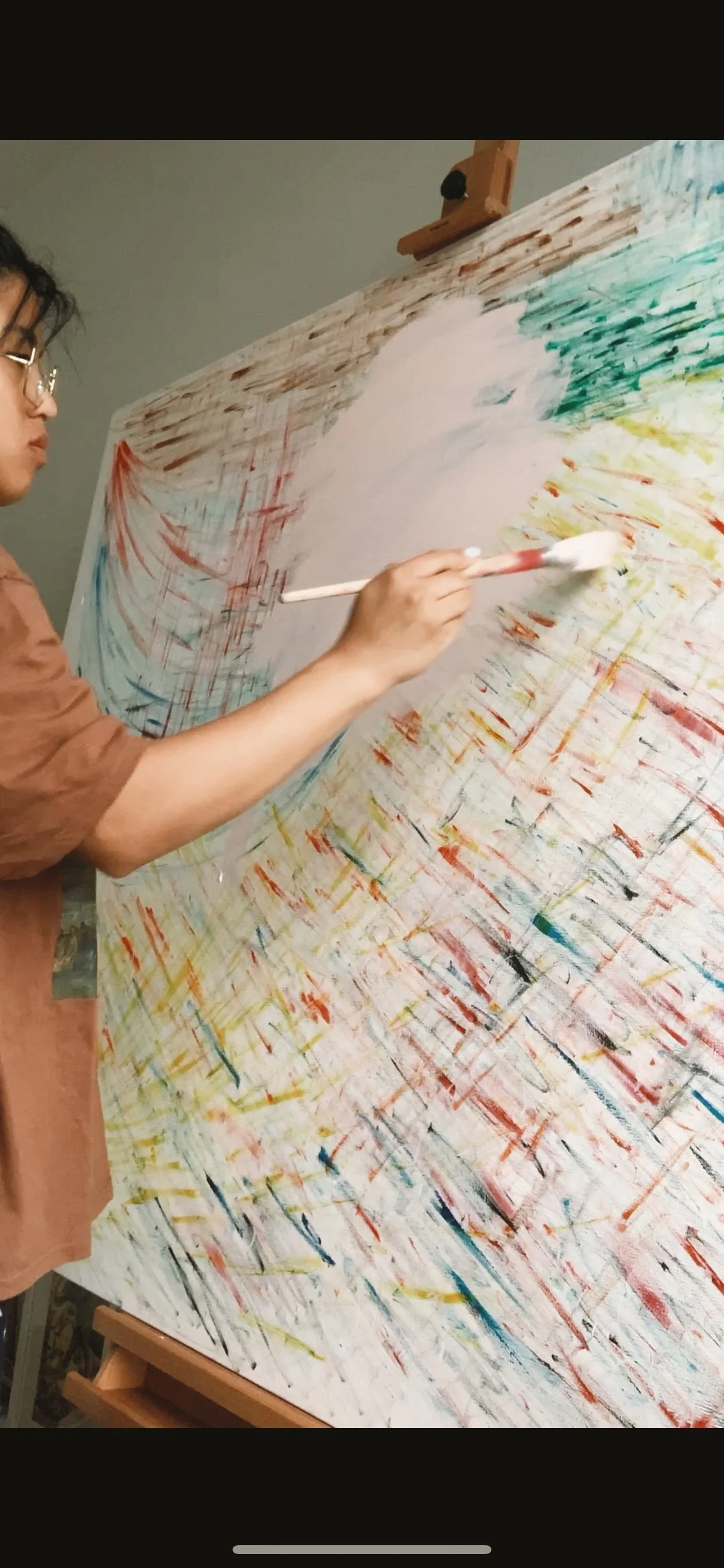


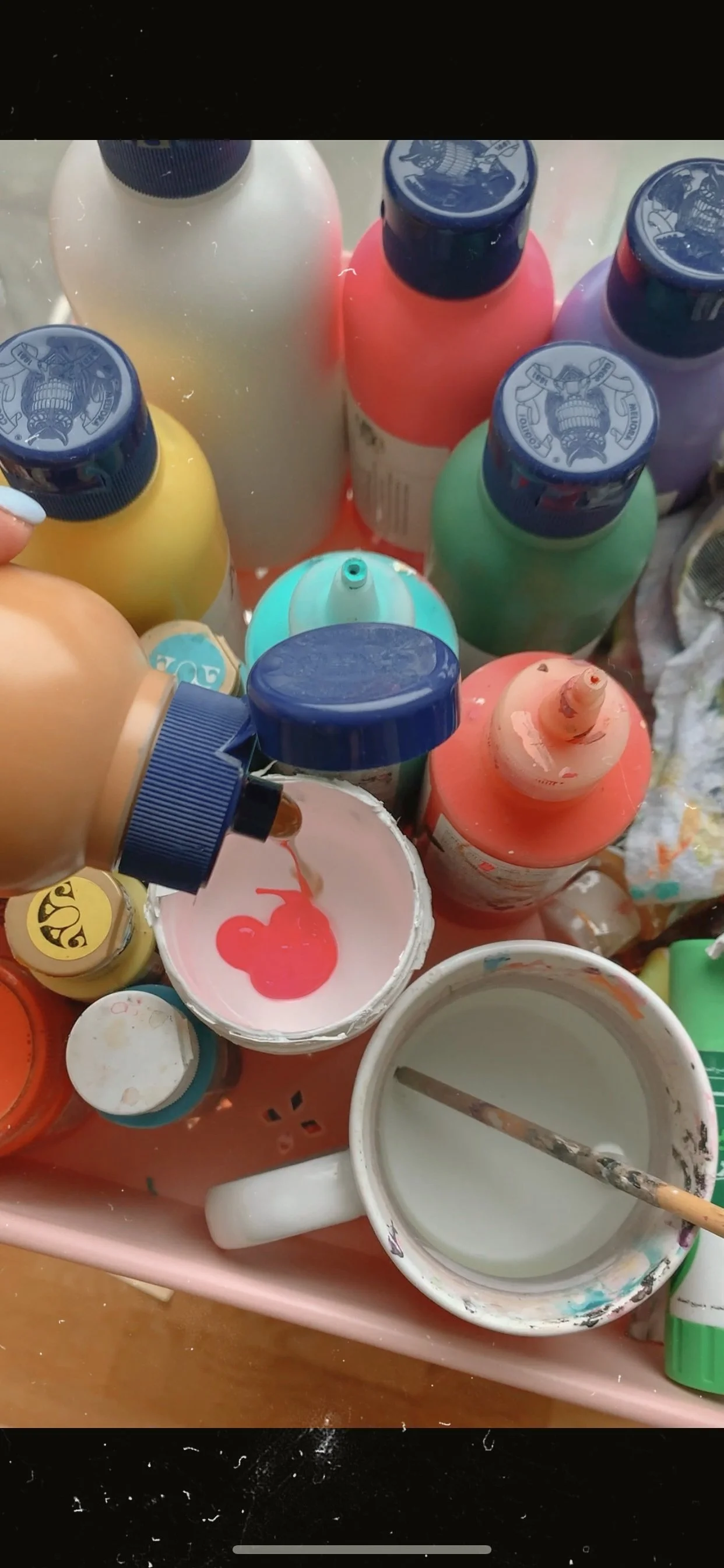
I finally made use of this 90 x 121 cm canvas passed on to me by the former tenant of the apartment who also happens to be an artist himself.
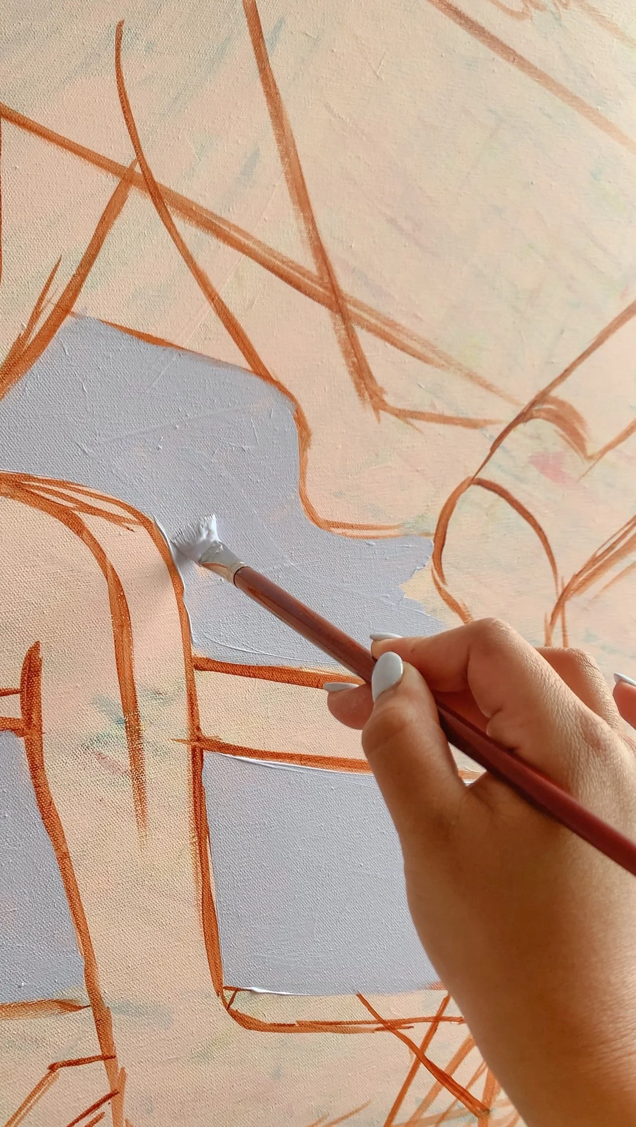
By mixing 60 percent Titanium White, 20 percent Neon Pink and 10 percent yellow ochre, I began laying the under paint to say goodbye to the old abstract painting underneath.
I always find pleasure in challenging myself when it comes to exploring new techniques. I attempted to use high key colors on this painting but the attempt was in vain in the end because— well, old habits die hard.

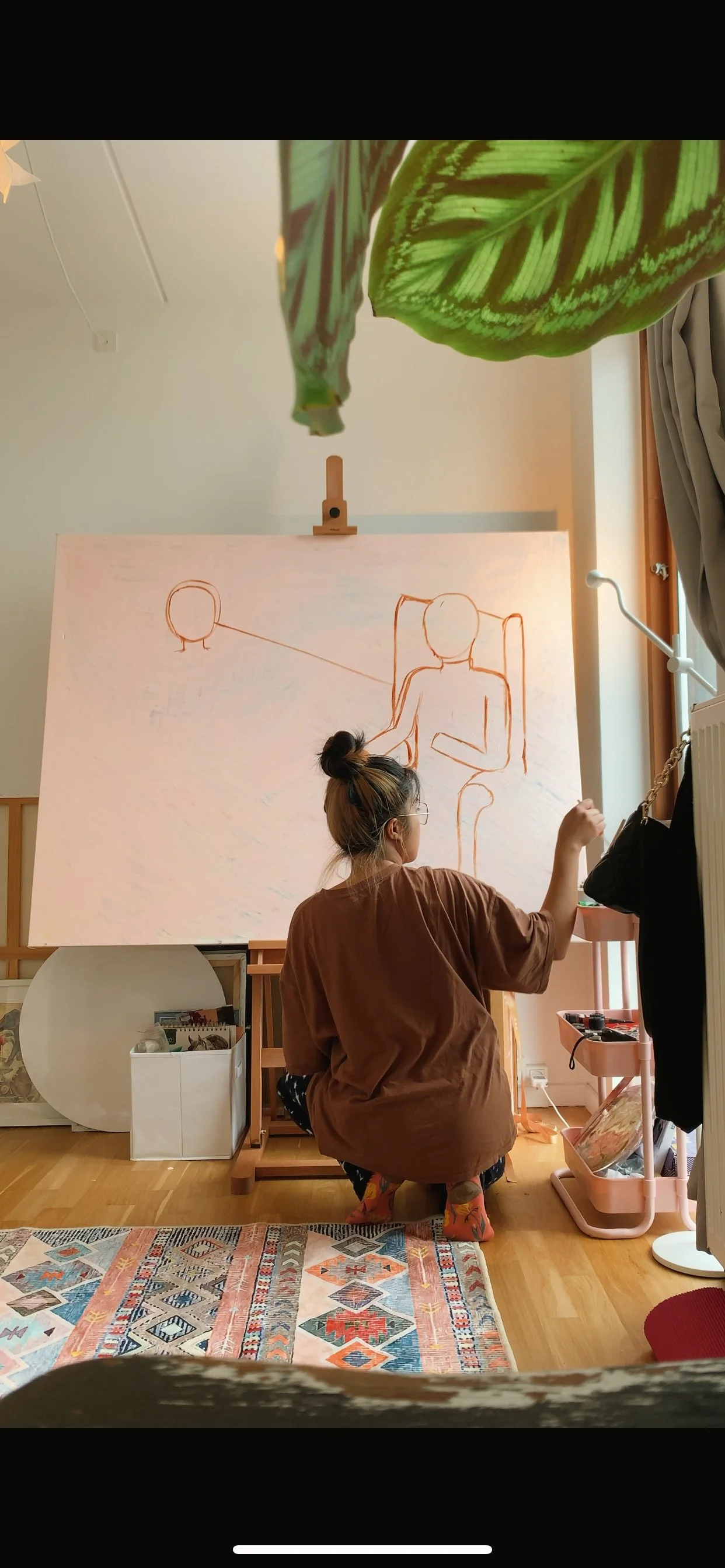
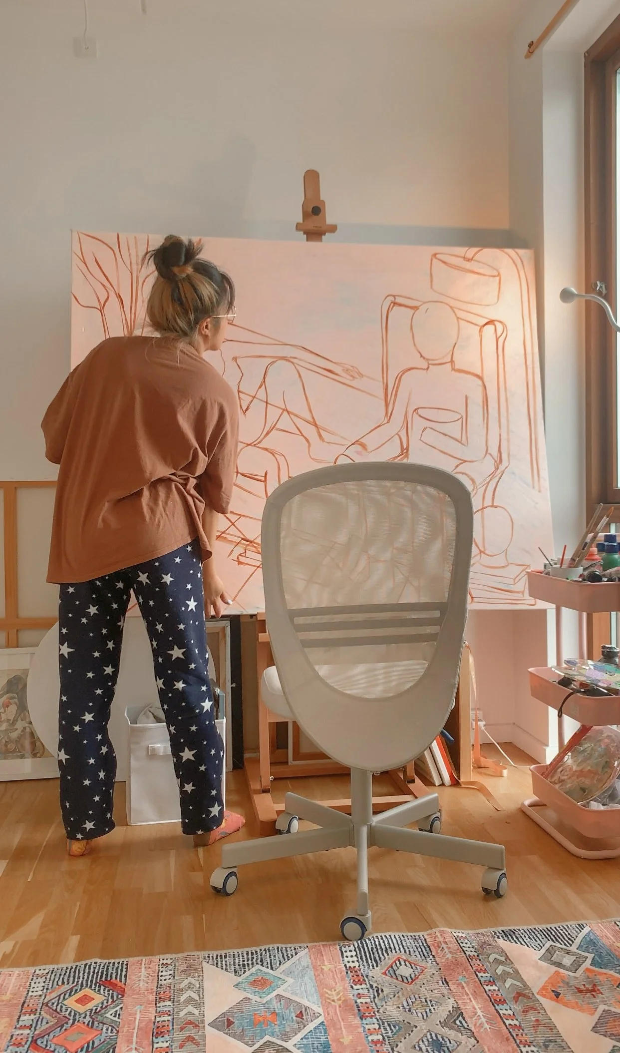
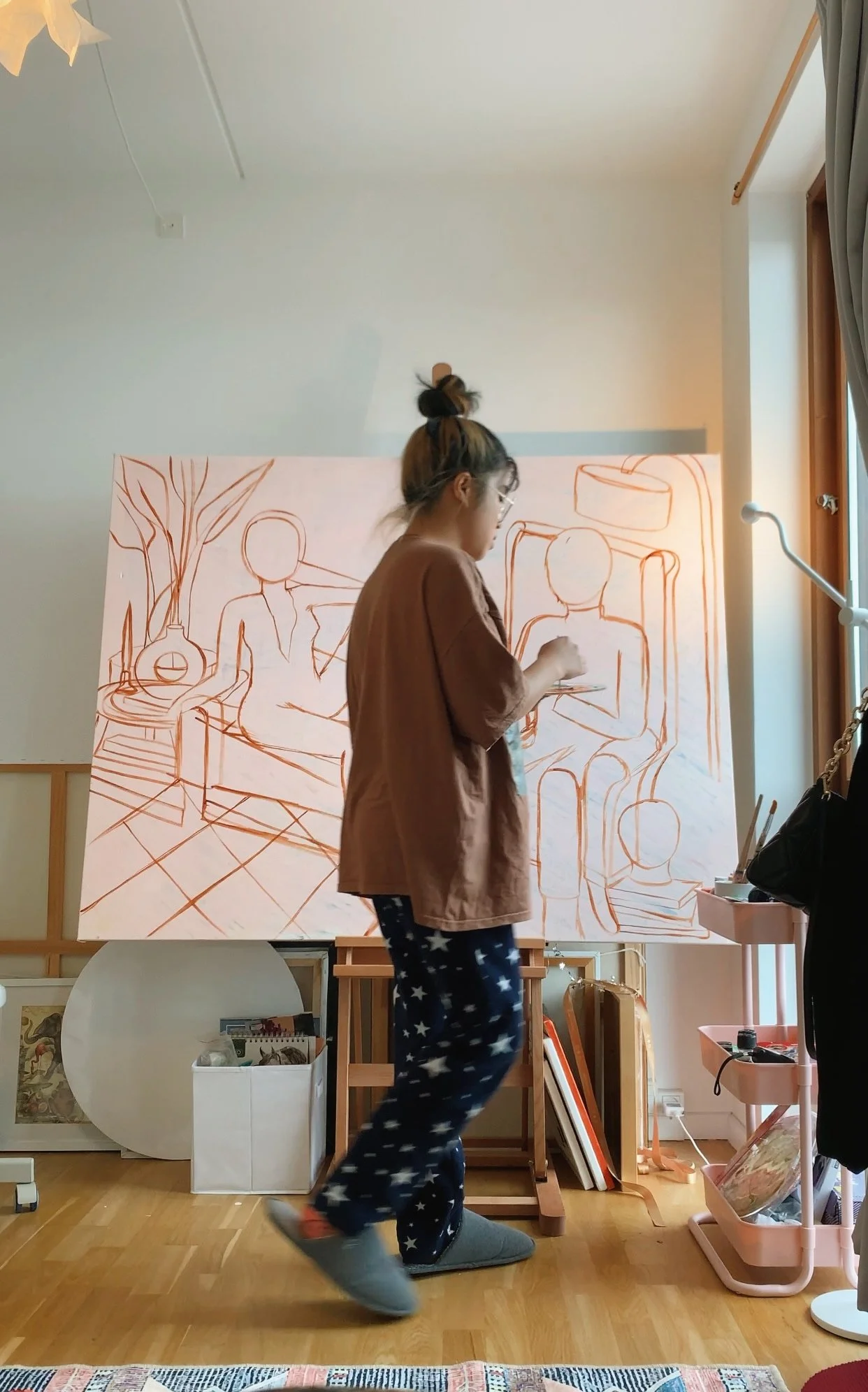
A monumental breakthrough: I drafted my elements without the use of pencil for the very first time. Using flat brush, I directly applied Burnt Sienna instead of Burnt Umber on the canvas to achieve lighter strokes. There were a lot of mishaps encountered during this phase— proportion and perspective wise— but it’s a great method and practice that I highly recommend as this stage offers plenty of room for mistakes with no strings attached. Whatever off-putting line comes to the surface, the second or third coats of paint can still cover it up.


You’re now looking at the most taxing part of this painting. I was firstly unhappy with the flatness of the fabric on the arm despite my attempt to introduce contrast and shadows for a more realistic feel. As a solution, I went all in by referencing a photo of my arm wearing my husband’s hoodie.
It’s a well-known fact that acrylic paints dry quickly so it’s not an ideal medium if you’re aiming for a seamless blending and color transition. But working on it for the past 7 years, I kind of adopted ways to maneuver this tricky medium after hundreds of hours of practice. Values were established on this particular area using Burnt Umber to map out the dark and light tones. I mixed Lilac and Burnt Umber, and a little bit of Titanium White to tone down the saturation for more calming effect. Using Titanium White and a dab of Lilac, I painted the highest points of the crease to enhance the light source.
After 2-3 hours of toiling on each arm, the elusive creases gracefully entered the picture. AAAAAAHHHHHHHHHHHHHHHH!!!


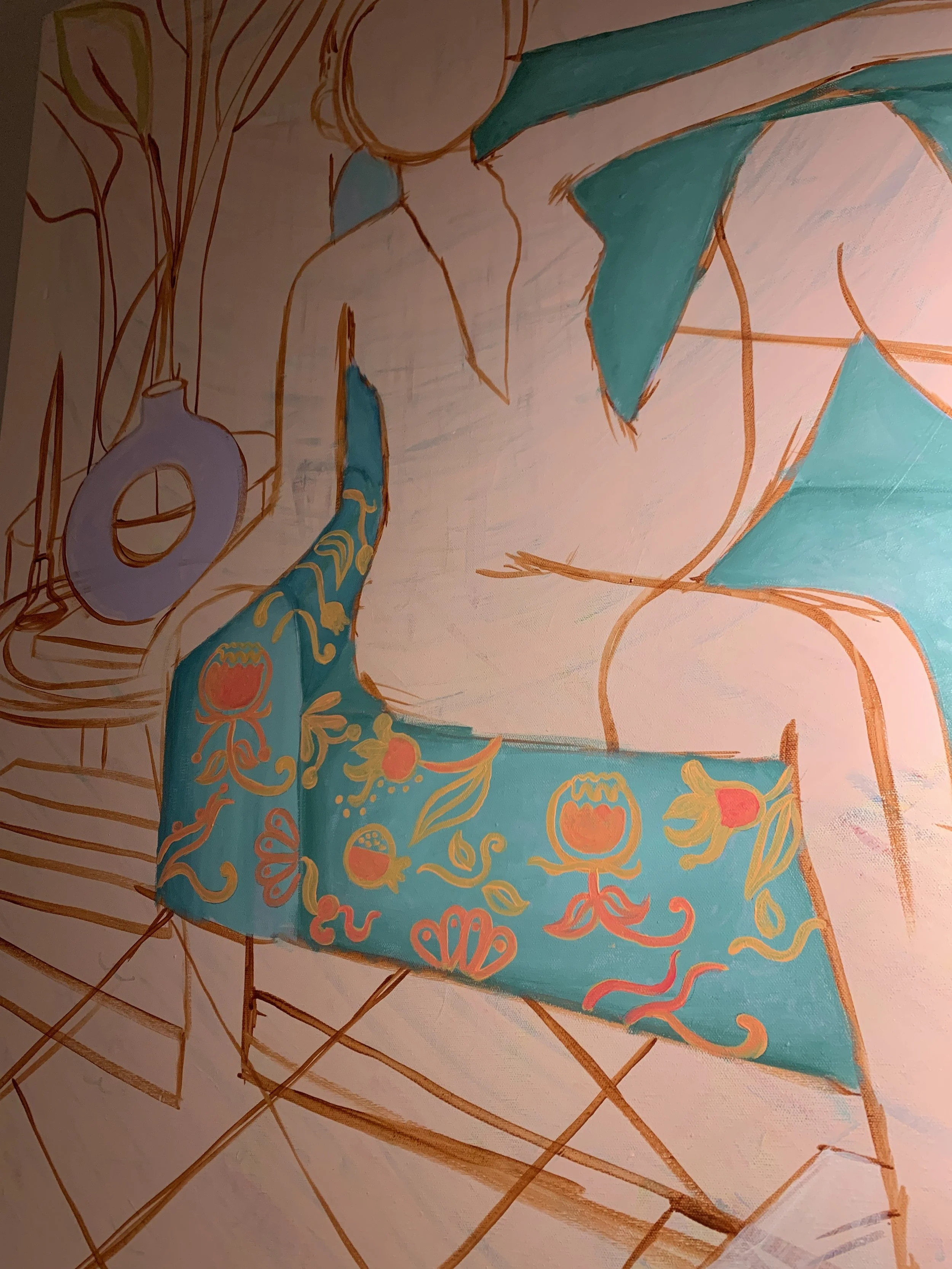
I knew that there is no return when I broke the “minimalistic” code of this painting after deciding to add the Baroque-inspired print on the couch. What was I thinking? I don’t know. I guess my hands love labor, it’s a part of my body that loves to dabble on empty spaces on the canvas whenever it can: my brain its accomplice.
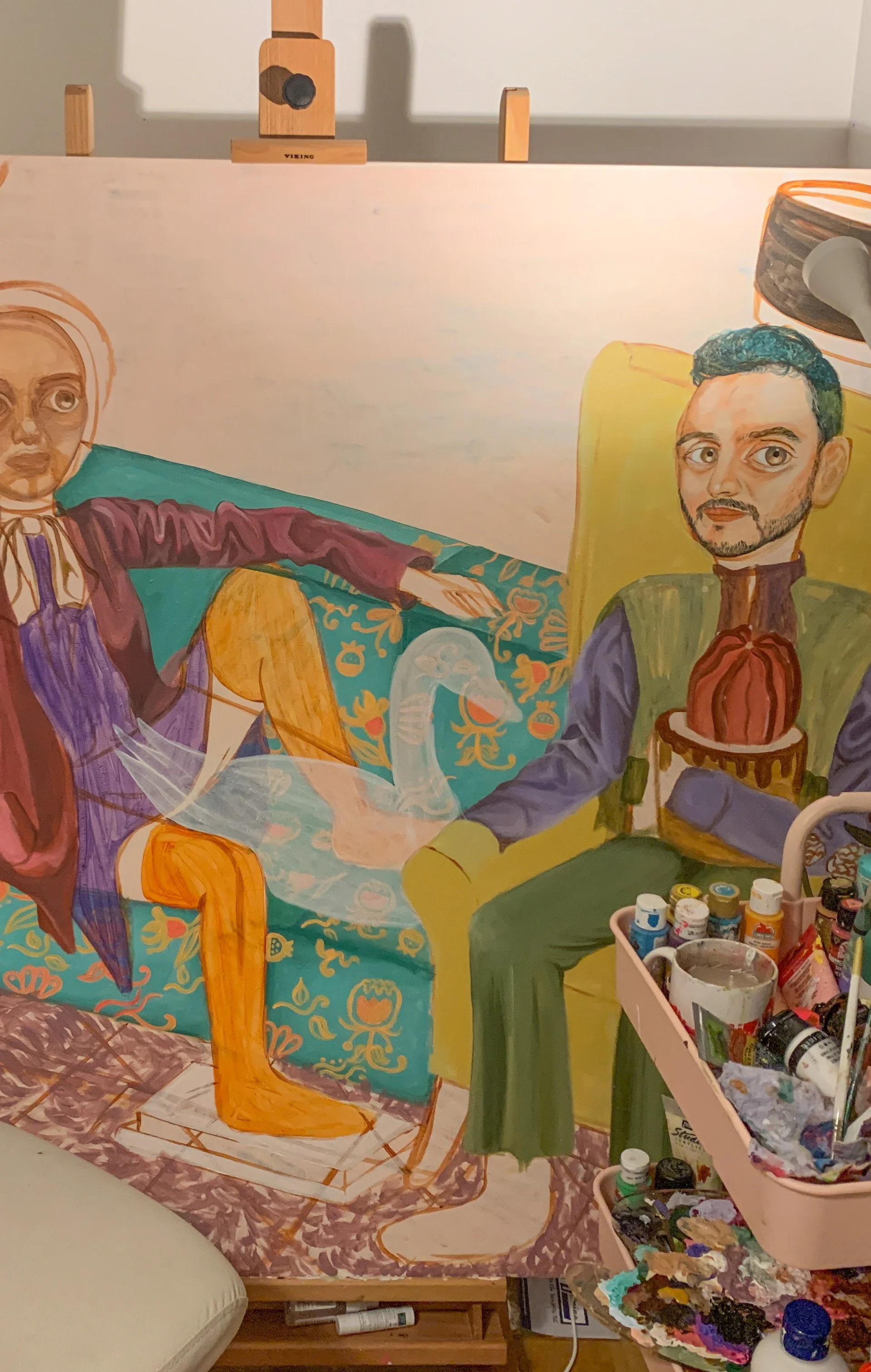
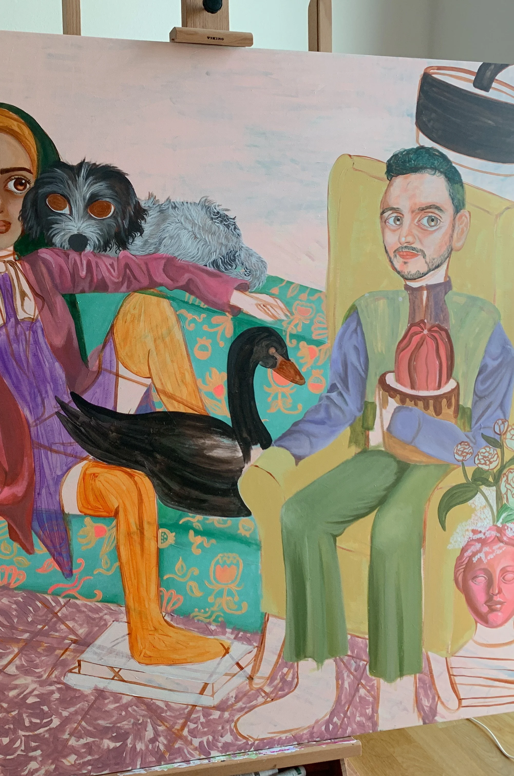

To add a little more oddity, I chose a black swan to fill the space that was begging for my attention. I met another challenging situation when I realized that using Titanium White as highlight won’t look as pleasing as it would when mixed with a pinch of blue. It’s also more logical given that black absorbs light unless it is a shiny surface. In this case it’s a swan and we like a little fun so I mixed Primary Blue and Titanium White then aimlessly but patiently blended it with Black until I reach the desired outcome. Mind you, it was experimental.

The classic digital color study to feel a step closer to the outcome.


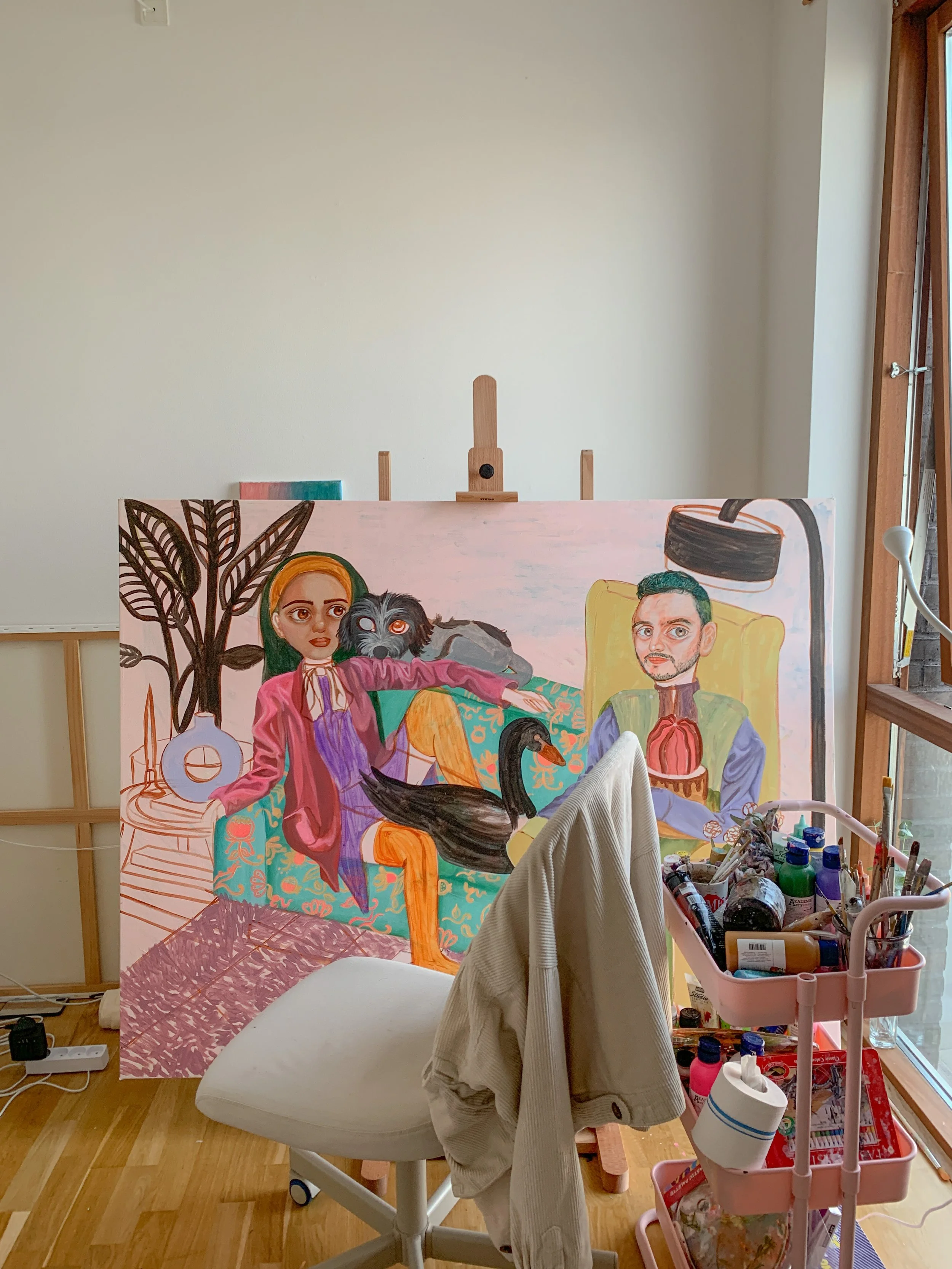
Hello, welcome to my studio.


Final touches on details. Watch the video here.

The finished product.
This project provided a place for me to reflect on my current reality and bask in the gratitude of living the life I’ve manifested in years. There were also key points I picked up along the process and it all goes down to learning a thing or two about one’s ability to create and step on unfamiliar territories.
Meanwhile, if you want to stay updated on my latest art shenanigans, follow me on Instagram.
Until next time!